TL;DR
When someone needs housing immediately, a search that returns the wrong results isn't a small problem. We tested users with traumatic brain injuries (TBI) and discovered that they couldn't find help that fit them. Our heuristic evaluation showed that the same issues affect everyone.
I worked across usability testing and synthesizing, then led the design and prototyping: mapping how Washington 211's search fails users and designing solutions that address the highest-priority breakdowns.
Background
People couldn't find information, so they kept calling
Washington 211 is a nonprofit that points people across the state to essential services. Many callers were asking about information already on its website, overwhelming the call centers. Because its users have such different needs, we partnered with the Department of Social & Health Services to design for many of them at once.
Our initial assumption
We believed people with traumatic brain injuries (TBI) were giving up because results didn’t fit them
People with TBI kept landing on services they couldn’t use, so we set out to understand what kept them from reaching support.
Our north star
How do we make results fit what people search for, and pages easier to follow, so people with TBI can reach the support they’re eligible for?
Research
Watching people search for help
We watched 6 people with TBI work through 4 tasks on Washington 211, recruited from 41 screener respondents, guided by DSHS’s research on TBI, and paired with a heuristic evaluation of the site.
“Results were garbage... I would probably give up at this point."
— P1
Insight #1
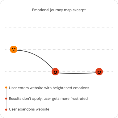
Searches returned services people couldn’t use
Only 67% could identify a resource that fit their need.
Insight #2
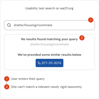
You can only get returns if you type the exact right words
Results depended on matching Washington 211’s own labels.
Insight #3
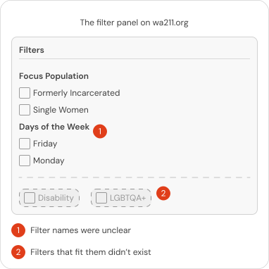
Filters didn't help
Only 50% could narrow their results.
Insight #4
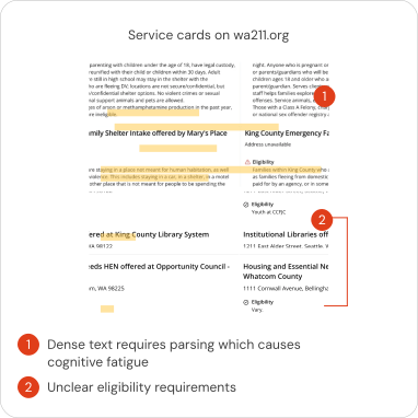
Dense text made it hard to concentrate
Key details were buried in long blocks of text.
Process
The problem was never just about TBI
Our heuristic evaluation found 21 design and interaction requirements rated major or critical, with accessibility the most severe, so every decision below was made for all of Washington 211’s users.
Widening from TBI to everyone
What we thought was a TBI problem was everyone’s problem. The only thing our problem statement needed to change was who it described.
Our actual problem statement
Users with traumatic brain injuries struggle to identify eligible services when presented with ambiguous or non-applicable options. This exposure to irrelevant options causes frustration and forces users to abandon their search before securing valid support.
Mapping why search fails
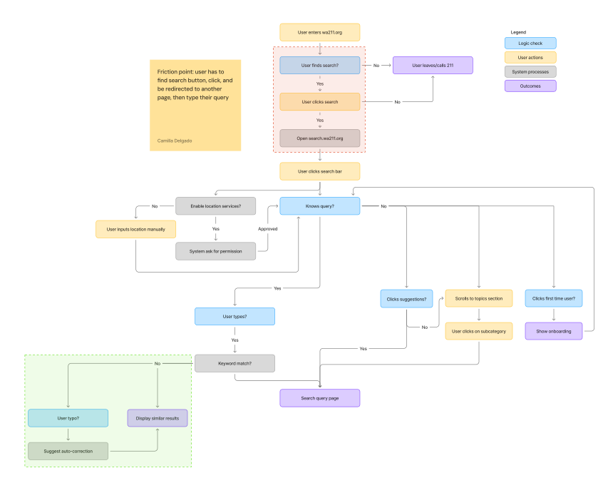
Before designing any screens, I mapped how a search moves through Washington 211 today, from landing on the site to reaching a result. Two breakdowns stood out: people have to go through three steps and a jump to a separate site before they can type anything, and exact keyword matching means anyone who doesn’t use 211’s own labels gets nothing useful back.
Deciding what to fix first
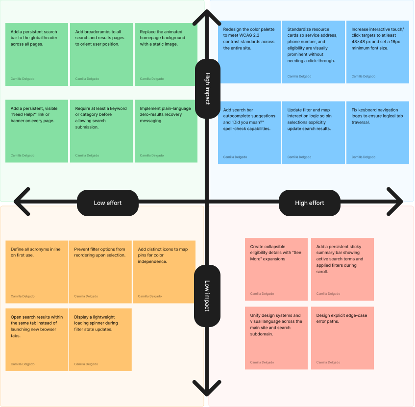
Given we had 21 recommendations and limited resources, we sorted each one by impact and effort, so Washington 211 could start with the fixes that help most for the least work.
Final product
Every search leads somewhere
Toggle to compare
Results that start where you are
Toggle to compare
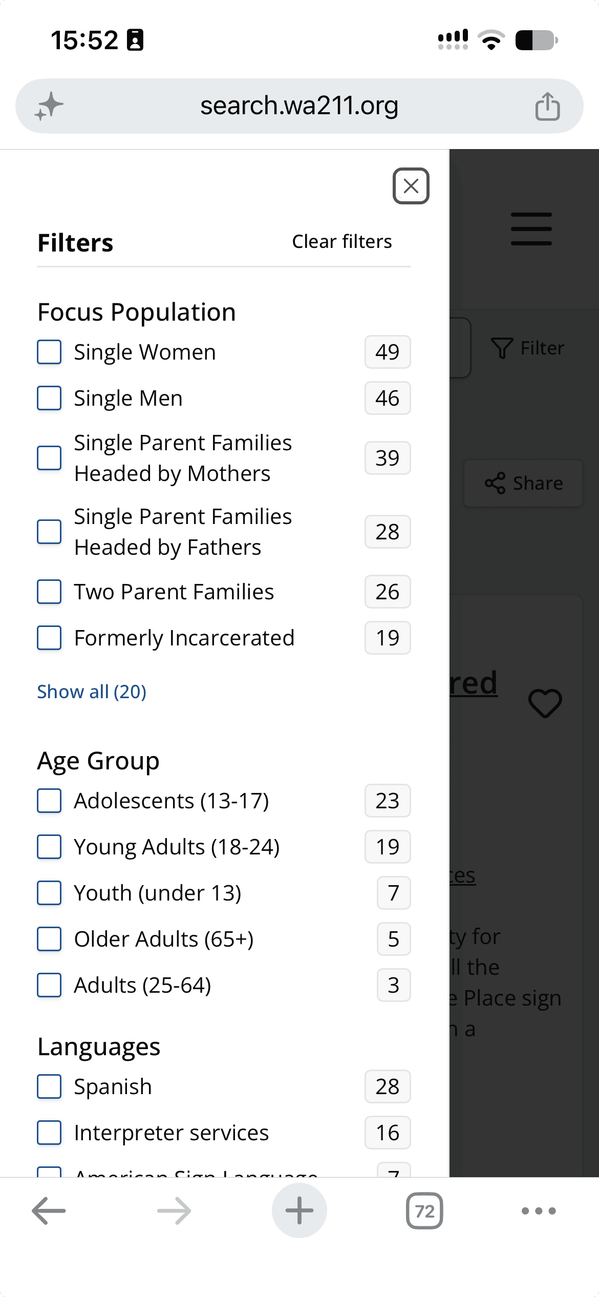
Improving filter visibility
Each filter group is now a single dropdown inside one collapsible panel, and everything that’s applied shows as a tag people can remove.
Toggle to compare
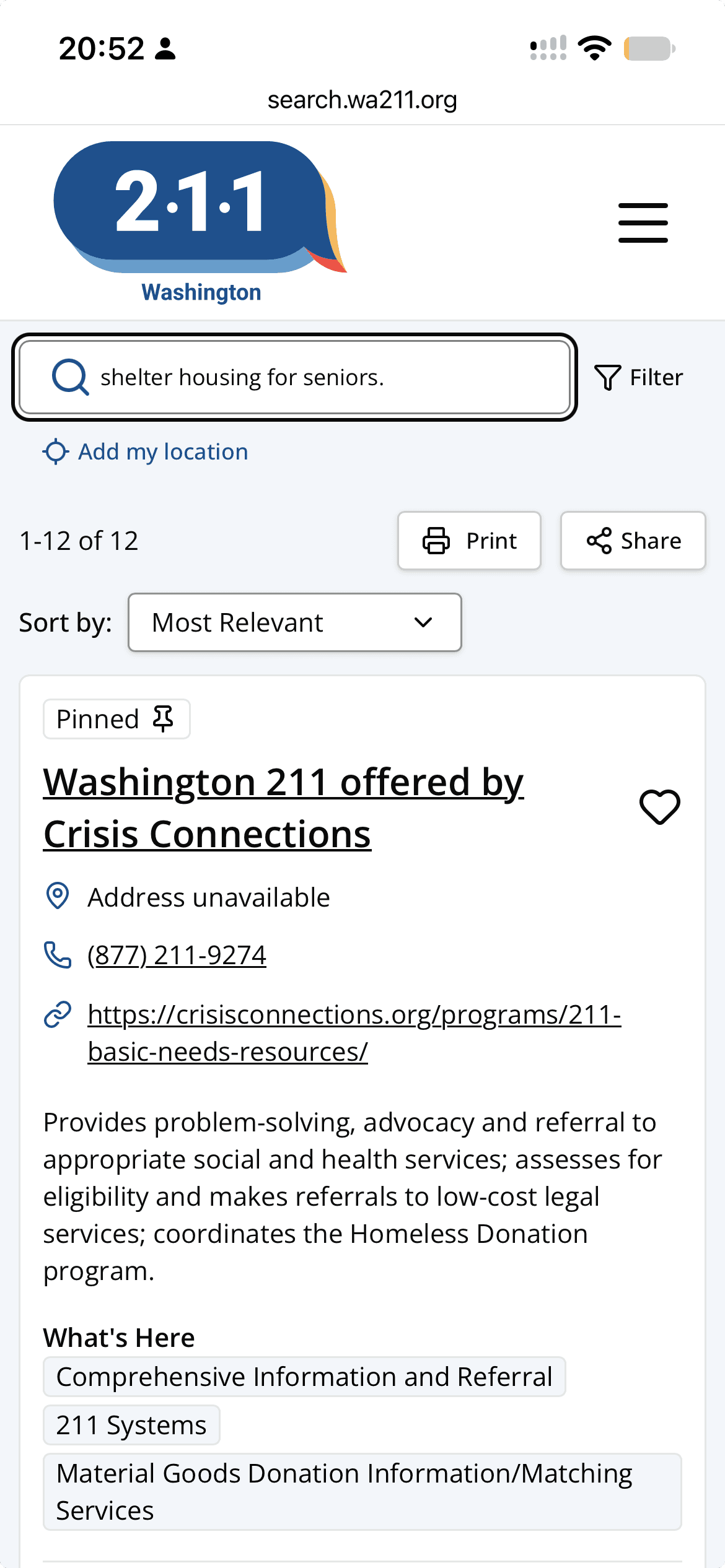
Reducing cognitive load on resource cards
Who each service is for sits up top as tags, details are trimmed to essential information, eligibility is shown on a first glance, and the main button matches how to reach it.
Toggle to compare
Outcomes
Our research findings are currently being built!
It is incredibly satisfying to work on a project as important as this one and to see our recommendations being implemented throughout the year. While we no longer work with WA211, we remain loyal fans of their work.
“This is the best report from a student body I've received to date."
— Skylar Young, CEO
Reflections
The best pattern isn’t
always the right one
We flagged the “safe exit” button as a bug because it sent people to Microsoft Edge. Washington 211 explained it exists so people in abusive situations can leave the site quickly. A pattern that looks wrong in a heuristic evaluation can be protecting someone, and context from stakeholders changed what we recommended.
Pivot, pivot, pivot
We started this project knowing that we had to make additional adjustments to make our usability tests as minimally cognitive taxing as possible. We had pilot tests with DSHS and did extensive research on the matter. It was still not enough. We had to remain flexible among technical difficulties, surprising findings, and a high drop-out rate.